
My website was fine. That was the problem. I built kepakisan.co.nz with AI in the first place, and it looked exactly like that: a cream background, a big italic serif "Hi, I'm Maha", a little pulsing "open to consulting" badge, floating stat cards, emoji tiles. Not bad. Just the same as every other site an AI makes when you ask it for a personal website.
But the cream wasn't really the problem. It didn't feel like me. It wasn't a Maha Kepakisan brand, just a website. I'd been looking at award-winning websites and thinking, mine doesn't feel like that. Then an Instagram Reel popped up claiming a handful of links would turn AI into a proper web designer. Instagram is not where I normally take engineering advice. But I was curious enough to open Claude Code, point it at my repo and ask a slightly awkward question: can you make this look premium, not AI basic?
What started as a website refresh turned into a rebrand. Three days later the site had a design system and a Balinese identity. Then the CV and every blog post followed, and a few weeks later came a new mark, a brand book and a homepage headline I actually believe. This is the full story, including the bits where I was wrong and the bits where the AI was. The mistakes are the useful part.
Why bother with a brand? I'm a big believer that a personal brand matters more now, not less. With AI, a lot of technical work is easier to reproduce than it used to be. What people remember is the person: your story, your voice, and the proof behind it. The brand gets you noticed and remembered. The proof is why people trust it. My site needed both.
If you only want the takeaways, they're at the end. Jump straight to them.
Ask Before You Install
The Reel pointed at four links: Taste Skill, Impeccable, awesome-design-md and img2threejs. My first message to Claude wasn't "install these". It was: before you do anything, tell me if that's true.
A skill is a set of written instructions the AI reads before it starts a particular job. Think of a new staff member on their first shift. They already know how to do the work, but you hand them the "how we do it here" guide so they do it your way. Same person, same ability, better habits.
A design skill is that guide for building websites: what good spacing looks like, which fonts work, which patterns scream "AI made this". The AI reads it first, then builds.
Here's how the four stacked up.
| Link | What it is | Verdict |
|---|---|---|
| Taste Skill | Design rules the agent reads before building: layout, type sizes, spacing, hierarchy, motion. It also bans the patterns that make sites look AI-made. | Use it |
| Impeccable | Built on Anthropic's own frontend design skill, with deeper guidance on type, colour, motion and UX writing. Has audit, critique and polish commands, plus a detector for generic "AI-generated" design. | Use it. Probably the most useful of the four. |
| awesome-design-md | A collection of DESIGN.md files describing the design systems of sites like Stripe, Linear, Vercel and Apple. | Good for inspiration, but copy one too closely and your site looks like Stripe's, not yours. |
| img2threejs | Turns a photo of an object into a 3D model in the browser. | Not for a personal site made of plain HTML. Impressive, but it adds weight for nothing. |
Funny thing about img2threejs: it really wasn't for my website, but it gave me an idea for work. Our health and safety app now has 3D renderings of our vehicles, built on the same Three.js idea, so people can pinpoint exactly where the damage is. That's a blog for another day.
Installing them was less exciting than it sounds. Claude copied both skills into a hidden .claude/ folder in my repo, plus Taste's separate "redesign existing projects" skill. Before committing, it read the one script in there that downloads a program, and confirmed it only fetched from the project's own GitHub releases. That's the kind of check I want done before anything lands in my repo, and it did it without me asking.
The Audit: 10 Out of 20
Step one was an honest look at what I had. Impeccable's audit scored my site 10 out of 20, which it calls "Acceptable, significant work needed". Darn, that sux. Fair though.
| Area | Score | What it found |
|---|---|---|
| Accessibility | 2/4 | My terracotta colour failed contrast. White on terracotta was 3.6:1 against a required 4.5:1. Some list text was about 10px. |
| Performance | 2/4 | 38 timeline logos loading at once. One logo was 690KB. The nav icon was 233KB for something shown at 50px. The pictures folder was 12MB. |
| Theming | 2/4 | Colour tokens existed but got bypassed by inline styles, especially on the blog cards. |
| Responsive | 3/4 | No sideways scrolling on phones, but the "scroll" hint overlapped the buttons, and on desktop the headline left "into" alone on its own line. |
| Looks hand-made | 1/4 | The textbook AI-template look. |
That last row stung, and it was right. The detector flagged the whole kit: cream background with terracotta accents, a big italic serif headline, a pulsing-dot badge, floating stat cards around the photo, blurred glow blobs, coloured left-border accent bars, emoji icon tiles and pills everywhere. None of them is wrong on its own. Stacked together, they're the uniform. And part of the reason my site looked AI-made is that my old palette was close to Claude's own warm cream style. Funny, that.
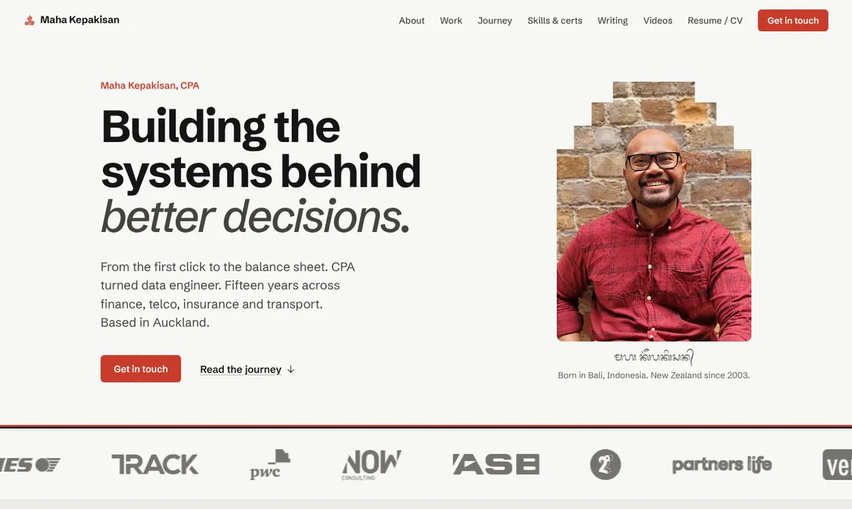
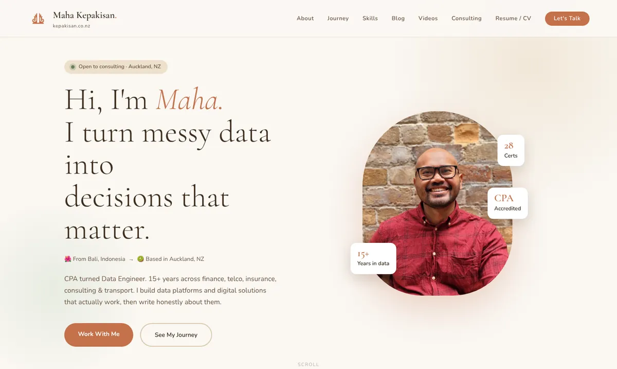
It said something nice too, which I'll take. The content was better than the design: the Bali to Otago to PwC to Ritchies story, real numbers like the $60k a year avoided on OpsCentre, an honest writing voice, a blog I actually keep updating, and a YouTube channel. The fix wasn't new content. It was a design that got out of its way.
Never Work on the Live Site
Nothing went near my live site until I was happy. All the work sat on a separate branch with one pull request, and my site runs on Azure Static Web Apps, which builds a preview site with its own URL for every pull request. The live site isn't touched until you merge. One pull request gives you one preview link, every push updates that same link, and when you merge or close the PR, Azure deletes the preview. I left the same PR open for the whole project and just kept refreshing.
Heads up if you're on the free tier: Azure Static Web Apps caps a site at 250 MB on the Free plan, and it counts everything you deploy, which for a simple site like mine is the whole repo, not just the pages people visit. I found out while writing this post, when a 17 MB video pushed mine over and the preview refused to build. Keep videos on YouTube, go easy on screen-recording GIFs, and delete files nothing uses. If you outgrow it, the Standard plan raises the limit.
No IDE needed. Just your phone and a link.
Screenshots in a chat are fine, but nothing beats clicking around the real thing, on a laptop and on a phone. And this changed how I check things.
Before
Now
That's a big deal for anyone who doesn't want to learn an IDE. If you're not techy and just want to iterate on your site from the couch, this is how.
It also checks its own work, and this is where Claude Code felt better than Kiro for me. It didn't just change the code and tell me it was done. It opened the site in a real browser, at desktop and phone width, in both light and dark mode, and actually looked at the result. I could see the screenshots it took as part of the process. It checked its work the same way I would.
Version One Was "Too Okay"
Claude's first go was an editorial, magazine-style look: big confident type, facts in thin "ledger" rows (which suits an accountant, to be fair), new self-hosted fonts and dark mode. Out went the cream, the italic serif, the glow blobs and the emoji. It even fixed a broken Bartercard logo on my live site I didn't know about.
My honest reaction: I liked the typography. I didn't like my photo being square, I couldn't tell where one section ended and the next began, and overall it was too okay. Nothing wow.
Claude's answer was that "wow" mostly comes from motion and interaction, not layout, and it gave me five very different sites to look at. One stuck: Dennis Snellenberg's, for the feel. Things move because you scrolled, not because a timer said so. I didn't ask for a copy. I said what I liked, with one condition. Dennis is a UX designer and I'm an engineer, and I didn't want to pretend to be him.
Bring references, and say why. "Make it modern" gets you the average of the internet. "I like how this one moves when you scroll" gets you something with a point of view.
A few things got borrowed from Dennis and adapted for an engineer. On your first visit, a dark screen flicks through Om Swastiastu → Halo → Kia ora → Hello (Balinese, Indonesian, Māori, English), then slides away. My Bali to New Zealand story in under two seconds, once per visit. The buttons are magnetic and lean toward your mouse. The closing section's top edge curves and flattens as you scroll into it.
What got left out on purpose: custom cursors, hijacked smooth-scrolling and constant animation. That's what makes Dennis's site read as a designer's site. Mine keeps the substance up front, with motion as a finishing touch.
Making It Look Like Me: Bali
This is the part I'm proudest of. It's the soul of the site now, the thing that makes it mine and not just another AI-generated site. I asked a simple question: any idea how to bring Bali design into this? Here's what came out of it.
- Tri Datu. Red, black and white, the three sacred colours of Bali, the same as the benang tridatu thread bracelet you see tied around wrists: red for Brahma, black for Vishnu, white for Shiva. They're the whole palette now, with red as the only accent, and it matches the red shirt in my portrait. They also run as one thin thread across the very top of the screen, filling left to right as you scroll, which doubles as a reading-progress bar. Look up, it's on this page.
- The candi bentar gate. The split, tiered temple gate you walk through at every temple in Bali. My logo is already a gate, so its stepped shape now opens the site: the intro screen splits left and right to let you in, and the same tiered frame sits around my portrait on the homepage.
- My name in Aksara Bali, the Balinese script, under the photo: ᬫᬳ ᬓᭂᬧᬓᬶᬲᬦ᭄. Claude couldn't verify the spelling itself, so it showed me the letters one by one (ma · ha · ke · pa · ki · san) and flagged the two tricky bits. Honestly, I've forgotten my Aksara Bali, so I told it I trusted its version.
- Poleng, the black-and-white checked cloth wrapped around the guardian statues at temple gates. On my site it marks thresholds: the bottom edge of every page and the end of every blog post. If the gate intro is the entrance, the poleng is the way out. Scroll to the bottom of this one and you'll see it.
Claude was careful with the cultural side. It raised the obvious concern about poleng before I did: it's sacred, so decorative use needs care. That's why it only sits where it would in Bali, at the thresholds. And the red still passes accessibility contrast, at about 6:1 against the 4.5 minimum, with a lighter red in dark mode.
Now the colours mean something. If anyone asks why my site is red, black and white, there's a story.
The Most Useful Thing It Did Was Say No
Partway through, I typed: "btw if any of my asks you think is bad idea, just say so please." That one line changed the whole project. Here's what it pushed back on, and where we landed.
| I asked for | Claude said | Where it landed |
|---|---|---|
| Tri Datu strips between every section | Rare is what makes it special. | One progress thread at the top instead. |
| Animated tool icons | Three scrolling strips on one page "starts to feel like a casino". Many of my tools have no usable icon, and Microsoft restricts its product logos. | No icons. Later, a one-off "burst" of word bubbles that settle into the list. |
| A map of where I've lived | Too much. One more big visual competing with everything else. | A quiet route in the About fact box: Bali, Christchurch, Dunedin, Auckland, joined by a red line. |
The AI isn't always right. The point is that both of you are allowed to say nah.
It went the other way too. "Too okay" was me saying no to its first draft, and you'll see me do it again with my CV. Say no, say why, look again. That loop is the whole method.
The Resume and CV Were the Hardest Part
My Resume and CV are HTML pages I print to PDF, and I need exact A4 pagination. No extra page with three lonely lines, no big gap halfway down. I'd tried this before with Kiro, asking it to make it pixel perfect so I could print it on A4, and it never quite got there. Claude Code rebuilt them so the Resume prints to exactly 2 pages and the CV to 4, and it checked the page counts in a browser before every push. After my Kiro attempts, that alone felt like a win.
The look was already mine. I designed this two-column style myself, well, about 90% of it, before AI was in the picture. In Microsoft Word. If you've ever tried to line up two columns in Word, you know the pain: nudge one text box and the whole page reshuffles itself like it's got somewhere better to be. When I first built the site, I asked AI to make the Resume and CV match my website, and this time I asked the same again, so the branding stays consistent everywhere. Its first rebuild came back as a single column, the kind every applicant tracking system loves. I didn't like it. Two columns is deliberate: it stands out instead of blending in. So two columns stayed as the default, with ATS versions in the same folder in case an online application form needs one.
When the Chat Gets Too Long, Write It Down
I started with other people's skills. I finished with my own.
Taste and Impeccable. Someone else's rules for good design.
DESIGN.md and CLAUDE.md. My rules, in my repo.
My own skills, so the next post or update is done my way, every time.
This is the bit I'd want anyone to take away. The Reel got me started with someone else's habits. By the end, the site had its own.
It started by accident. Part way through day one, I noticed the context window was at about 70%. If the chat ran out, a new one would have no idea what we'd decided. So I asked for a detailed markdown file in the repo that any future session could follow. Claude wrote two.
DESIGN.md is the full design system: colours, type, every component, the Bali rules, the motion rules and the gotchas we'd hit. CLAUDE.md is a short file Claude Code reads at the start of every session, with the house rules: never invent facts about me, no em dashes, one red accent, and check screenshots on desktop and phone before pushing.
Good thing, because the chat did run long, more than once. Each time, the work picked up where it left off, and the design didn't drift.
Make It Repeatable
Remember the skills from the Reel? You can write your own, and that's the last step of the circle. I asked for two.
Publishing a blog post
I write each post as one self-contained HTML file, CSS and all, paste it into my code base and say "make sure all links work and style adheres to code base standard". The skill now does all of it: swaps in the standard style while keeping each post self-contained, maps old colour names to the new palette so older diagrams adopt the look, fixes links and anchors, swaps Google Fonts for my self-hosted ones, fixes the social share image, lists the post on the blog page and homepage, and runs a checker for broken links, wrong fonts, dashes and emoji icons. It never touches my words. This post went through it.
Ranking my tools
My "Tools of the trade" list had some tools in bold, so I asked: did you bold these based on my timeline, or did you just guess? It had guessed. So we made the data decide. Every role on my timeline lists the tools I used there, the list orders itself by years of use, and bold means three years or more. Everyday tools like Excel sit at the end and are never bold, because Excel at the top is accurate and completely unimpressive. When my timeline changes, the skill re-runs the ranking, and it asks me rather than guessing when a tool has no role against it.
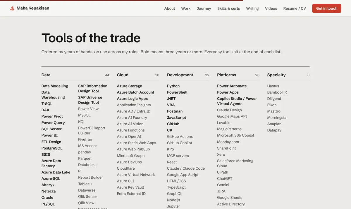
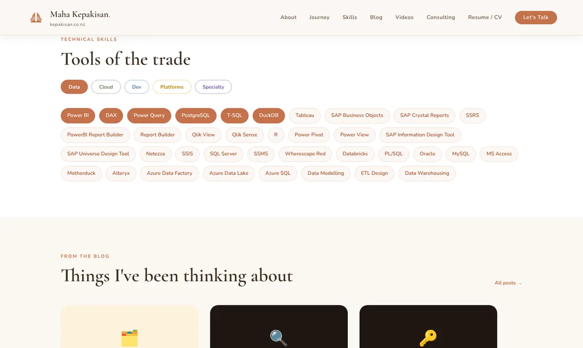
Two more before and afters
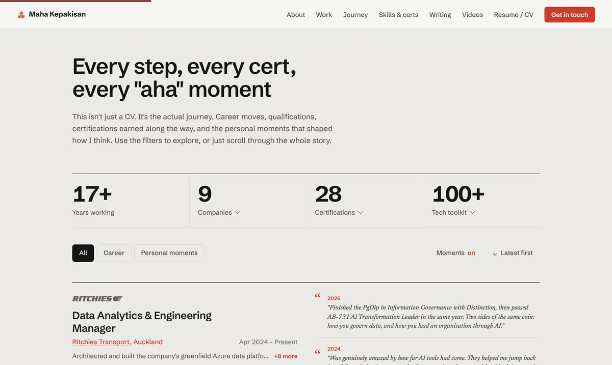
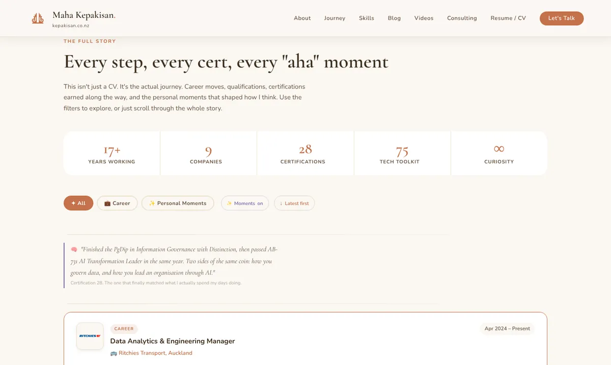
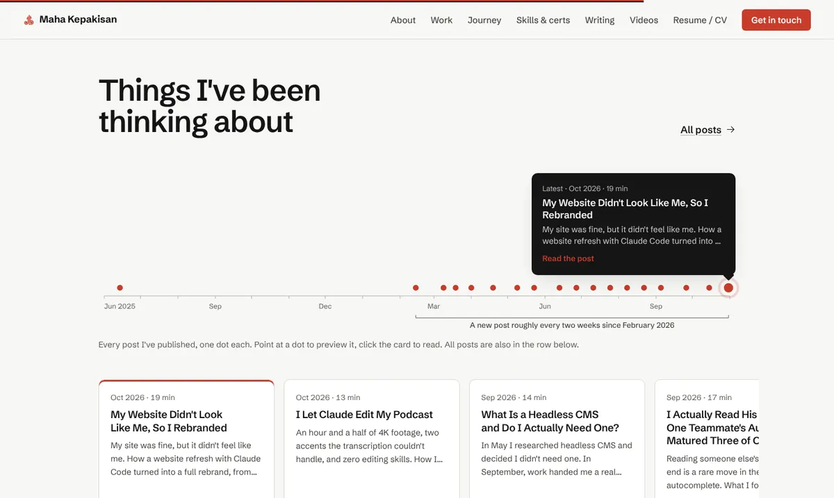
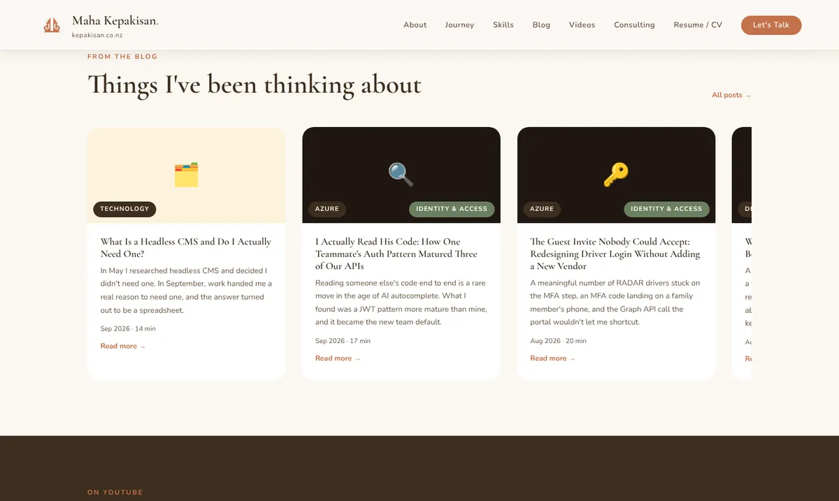
The Last Piece: The Mark
The mark came last, and on purpose. The website came first, since my live site already had most of this look and feel. The icon took longer, because I wanted to think it through. It's dear to my heart. It's the mark that is my brand.
The icon journey started with another Instagram Reel, this time about Google's Pomelli. I tried it, and it gave me a brand book and a place to start. Gemini and ChatGPT weren't great at producing high quality images, but they gave me the base and the foundation for the new mark. Claude then refined it into what you see here.
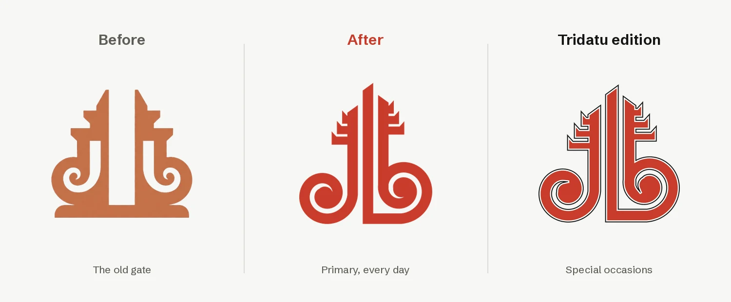
The new mark is about where I am now. I spent my first 17 years in Bali and the last 23 in New Zealand. For a long time I couldn't call myself a Kiwi. As I get older I feel closer to being one, but the Bali roots are still there. I'm a bit of both. So the mark is still the candi bentar, the split temple gate, but its roots are now koru. Bali-born, Aotearoa home.
Then there's the Tridatu edition, woven with the benang tridatu thread. In Bali today the three colours carry Hindu meaning: red for Brahma, black for Wisnu, white for Siwa. But the same red, black and white seem to show up right across Austronesian cultures, Māori and Batak among them. Coming from Bali, seeing those colours in Māori design here gives me a homey feeling. Two homes, one palette. I'm digging into that properly in a blog that's coming. For now the Tridatu edition is saved for special occasions. Every day, it's the primary red mark.
It all came with a proper brand book, and even the homepage headline now comes from it: "Building the systems behind better decisions."
And it came full circle again. The brand folder in my repo has a README that tells people and AI tools which file to use and when. So when I asked Claude to put the new mark on the site, it read the rules first, used the primary version everywhere, and asked me before touching the Tridatu one.
It Came to Work With Me
Here's the bit I didn't expect. Once I understood how skills work, I went looking for more. Then the algorithm noticed. Reels and YouTube Shorts kept feeding me skill after skill, which is a bit weird at my age, but here we are.
So I took what I'd learned on my own website and tried it at work, on TRAVEL, the charter booking app I built. Claude Code had always built it fine, but the UI never quite looked nice. This time I gave it the same skills I used here, and asked Claude to run a deep research search for any other skills that would help. It did more than reskin it. It regrouped the modules, so related ones now sit under a bigger one (capacity and day of ops both live under ops now), and it made it obvious what to do first instead of leaving people to work it out. Yes, it looks much nicer. But what I like most is that its first cut was already very good, and it cut down the clicks people need to get things done.
For the last year, my answer to "make it not look like AI" at work was Magic Patterns, an AI UI and UX design tool. It did the job, but the more I used it, the less I liked the pricing. And I don't love having lots of separate AI tools on the side. After TRAVEL, I stopped the subscription. I told my boss we don't need the US$17 a month anymore, because Claude Code can do the same thing, if not better. I just needed the right skills.
Honestly, this whole exercise blew me away with how good Claude has become. Since then I've hardly touched Kiro. I'm increasing my Claude plan and scaling Kiro back, and one day I might turn Kiro off altogether and use Claude in VS Code instead.
Before you pay for another AI tool, check whether a skill gets the one you already have there. For me it did, and one less subscription is one less thing to manage.
What I'd Tell You
to steal
Check the hype before you install it
Ask what a tool or skill actually does, and whether it fits your site. Install the one or two that do. More rulebooks means more conflicting advice.
Start with an honest audit
A score and a list of "this looks AI-made" patterns tells you what to fix. It also tells you what's already good, usually your content.
Get a preview link
If your host supports pull request previews (Azure Static Web Apps, Vercel and Netlify all do), you get a private copy of the new site that updates on every push, and the live site is untouched until you merge. Review the real thing, not screenshots in a chat window. You don't even need an IDE: talk to it from your phone and refresh the link.
Bring references, then say what you're not
"I like Dennis's motion, but I'm an engineer, not a designer" got me a better result than either alone. Two sites and one sentence each beat a page of adjectives.
Find something that's actually yours
For me it was Bali: Tri Datu, the gate, poleng, Aksara. It's what makes the site not look like anyone else's. Yours might be your city, your trade, your culture or your sense of humour.
Ask it to tell you when you're wrong, then argue back
The best decisions on my site came out of a disagreement.
Give small, honest feedback often
"Too okay." "The hover is in my face." "I can't tell who's selected." Short and blunt beats a long spec.
Never let it invent facts about you
Make it a written rule: never make up numbers, dates or quotes, ask. Then read every claim it puts on your site. You're the one who gets asked about it in an interview.
Write down the rules
A DESIGN.md and a CLAUDE.md mean the next chat, or the next AI, follows the same system. Turn anything you'll repeat into a skill.
Check everything, including yourself
It missed things. So did I. It once told me the blog was restyled when it had only tested on throwaway copies, and I caught it on the preview. "Done" and "done on the thing I'm looking at" aren't always the same. And I got plenty wrong about my own career until the audit table asked.
Tap a number to flip through them.
None of this needed a designer, a branding agency or a new framework. My site is still plain HTML, CSS and JavaScript on a free hosting tier. And it cost nothing extra, just my normal Claude subscription. What changed was the process: clear taste, honest feedback both ways, and a preview link I could click around before anything went live.
It's the same lesson I keep landing on with AI. It's an incredibly capable builder, and a surprisingly good critic if you ask it to be. Taste and truth are still on you. And when AI can build almost anything, the part worth investing in is the part only you can bring: your story, and the proof behind it.
Have a look around the new site and tell me what you reckon. And if you want to do this to your own site, or just fancy a yarn about it, flick me a message through my contact form. And if you know better skills, or just cool ones I should try, I'm keen to hear about them.
Cheers.